


Examples of Successful Rebranding
Rebranding is equal parts opportunity and risk. On the one hand, it gives you the chance to start fresh, to gain relevancy.
Rebranding is about more than just slapping up a new logo and calling it a day. It’s about helping your company, and your customers make the switch gradually and confidently to a company that demonstrates how it aligns with the very same values it presents to its customers every day. It’s about making sure that pride, quality, and satisfaction are more than buzzwords. And it’s about honouring your commitment to the new brand without abandoning the old.
On the other, rebranding – when done poorly – can set you back.
In our previous post we talked about why “a rebrand is not a bad sign”, the risk of rebranding and examples of rebranding that failed, and lessons learnt.
Here are four companies that successfully rebranded themselves:
Implementing a successful rebranding strategy can be a proactive solution to incite business growth and expand in new markets.
Examples of Successful Rebranding
Starbucks
![]()
Let us start with the coffee-making giant, Starbucks. Starbucks introduced a new identity and branding in 2011. The “seal” structure was deleted, and there is no mention of “Starbucks” anywhere on the cup. The updated logo and packaging focuses instead on a simplistic Starbucks siren illustration and a more contemporary bright green colour palette.
This was done as Starbucks wanted to explore new markets other than coffee.
With this change, they entered into new markets and came up with ice cream, alcohol, and many other products.
The logo rebranding initially led to a mixed response by design thinkers; however, it truly is an example of standing out from the norms of branding and being successful at implementing a bold vision. It was eventually accepted among the masses.
They remained on the top in the coffee market, and the change of logo was a success.
Paypal

PayPal’s 2014 rebrand was a huge step forward in their visual language as a company. Their rebrand in 2007 still left them in the ’90s visually, and it wasn’t until they adopted single-story lower-case “a” s, a more crisp type treatment, and the over-lapping “P” s of the logo mark that their brand really felt re-born.
At first glance, the mark feels young, intelligent, advanced, and friendly. Their brand colours are now highly vibrant and saturated, and they have a whole slew of icons and illustrations in their arsenal. The colours, type, and icons play together in the mobile app making for a pleasant and effortless user experience.
Premier buy generic cialis online us pharmacy League
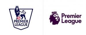
The Premier League is the top level of the English professional soccer league system. Established in 1992, the Premier League is owned by its own 20 member clubs that act as shareholders. In February 2016, the Premier League announced their first rebranding in a decade. A new visual identity following the previous title sponsor Barclay’s departure at the end of the season.
Lead designer Paul Stafford from the Design Studio said, “Our aim was to create an identity that acknowledges everyone who plays a part in one of the most exciting leagues in the world; with a fresh new take on the iconic lion, we’ve created an identity that’s purpose-built for the demands of the modern world while staying true to the premier league’s history and heritage”.
The new bold and vibrant identity includes a modern take on the lion icon – a symbol that is part of the competition’s heritage. Premier League rebranded with a digital and broadcast-first approach to make it work as an app icon. The new app icon is simplified with the lion prominent. The soccer ball was also deleted from the logo to simplify the design. This rebranding keeps with the growing design trend of no longer needing design elements, icons or symbols to define what they are.
The Premier League is known to have the best player, best teams, and possibly the best design to match, setting the tone for sport.
Airbnb
![]()
Despite its controversy, there’s no denying the success of Airbnb.
Airbnb moved from its old logo to a new simple design which caught the attention of many.
This helped to change the company’s initial perception because Airbnb’s reputation fell sharply after they faced various legal issues.
The new icon ‘The B?©lo’ highlighted four principles – People, Places, Love, and Airbnb, blended into a single “A” shape. For Airbnb, rebranding meant defining a clear brand message that would be easy to comprehend, welcoming, and appealing to its audience.
Conclusion
Some of the main reasons for a company to go through a rebranding are; internationalization, consolidation of a brand, a bad reputation, or a new CEO. Whichever case applies to you, you should pay attention to:
- Not underestimating the emotional bond customers may have with an old brand logo
- Being original in your design
- Ensuring the new logo shows what industry the company is operating in and where the company wants to go in the future
- Making the logo easy to understand and read
- Looking at the new design from different perspectives
Following these tips will help you to avoid being listed as a rebrand fail.
Implementing a successful rebranding strategy can be a proactive solution to incite business growth and expand in new markets. Rebranding, based on in-depth market research, gives customers something new and improved.
Do you want more information or help with a rebrand? Try not to make the same mistakes Get in touch.
