

Selected work Fudlore
Fudlore Good food.
Great stories.
A name built around African food and the knowledge we share.
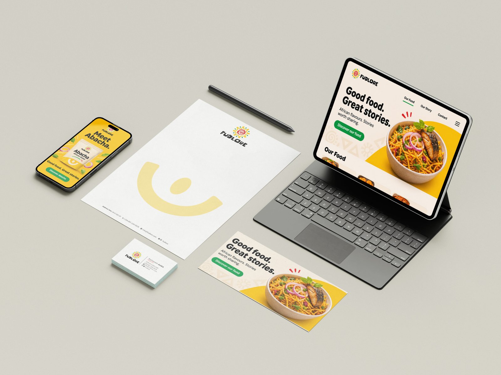
Argillic created Fudlore’s name, positioning and identity. The refreshed design presentation carries that foundation into a coordinated packaging, campaign and customer experience system.
Explore the project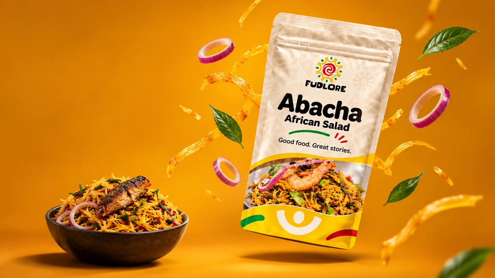
- Client
- Fudlore
- Sector
- Food production
Wholesale & retail - Capabilities
- Strategic Architecture
- Argillic’s role
- Naming, positioning & identity
Packaging, campaigns & applications
01 / Context
African roots. Everyday relevance.
Fudlore began with a practical ambition: make African staple foods convenient for people who care about what their families eat and want to stay connected to their culture.
The brief called for a welcoming, memorable brand that could express care, familiarity and value across wholesale and retail settings. Our task began with the name.

02 / Naming
Food + lore. A name with meaning.
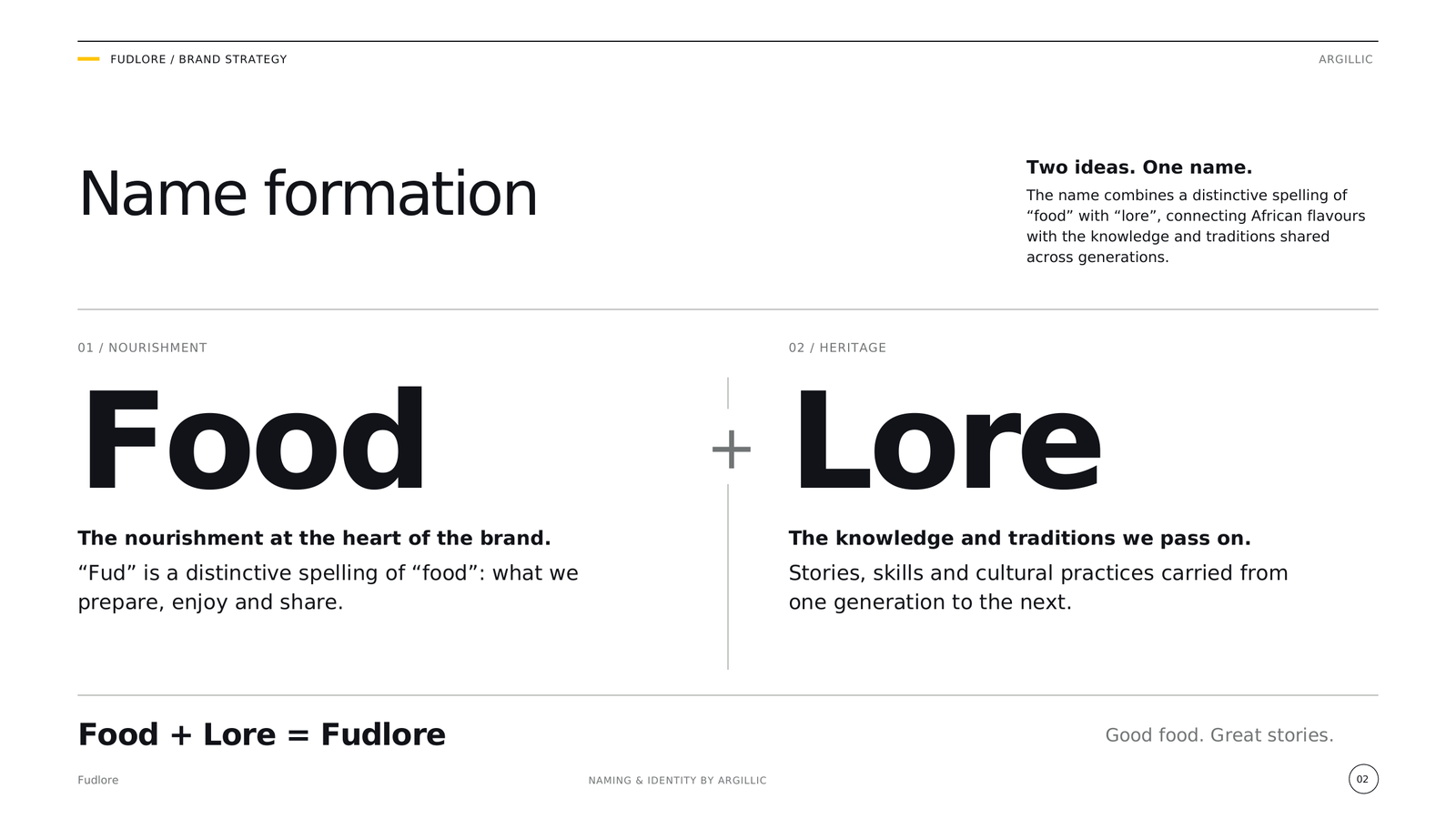
Argillic developed Fudlore by bringing together “food” and “lore”: the knowledge, traditions and stories passed from one generation to the next.
The name gave the brand a clear organising idea: African food as both nourishment and a connection to heritage. These excerpts are from our original naming presentation, dated 6 February 2017.

03 / Identity
A shared idea. A distinctive expression.
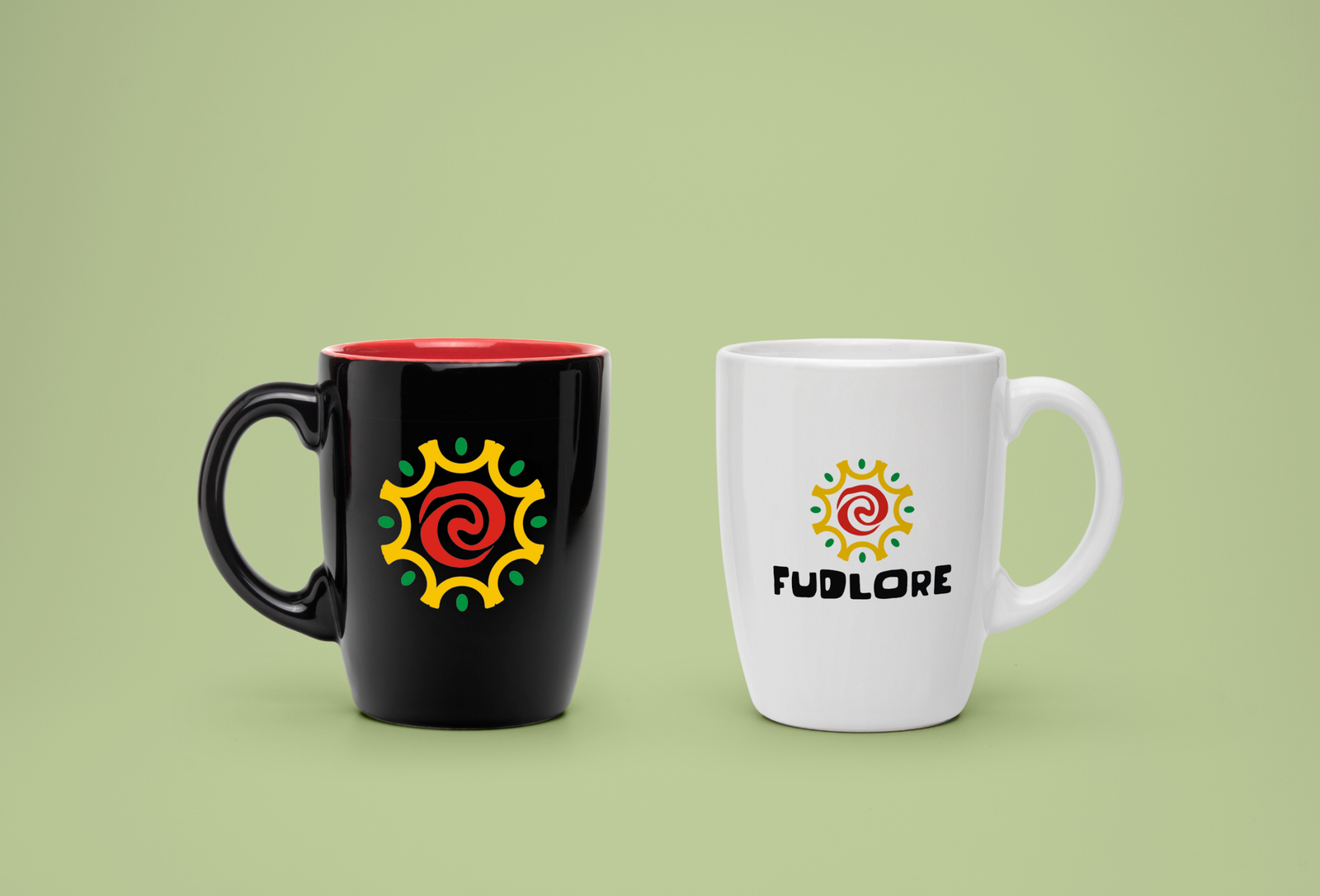
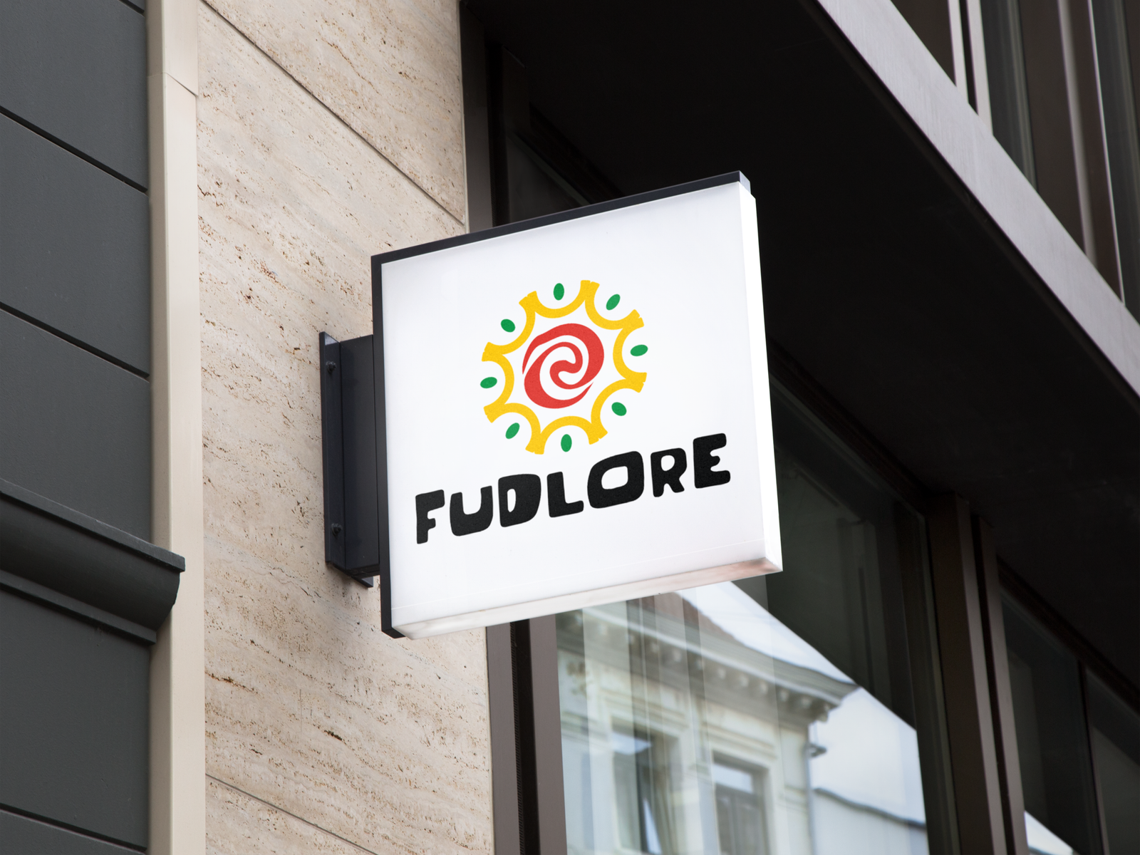
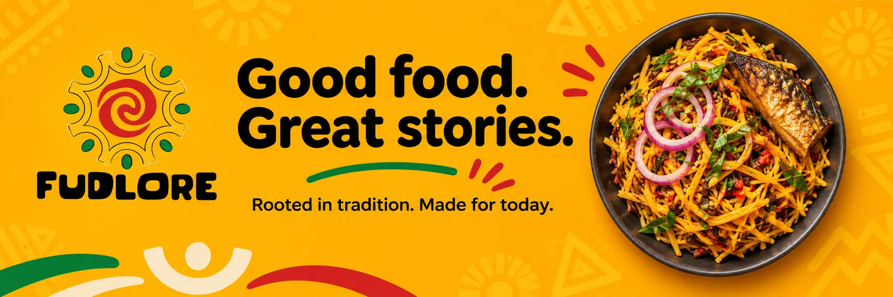
The identity combines a spiral, a sun-like form and a circle of people. Its warm yellow, red and green palette, friendly wordmark and geometric motifs create a lively, approachable expression.
The refreshed message, “Good food. Great stories.”, connects that visual language to the meaning of the name. The selected guidelines below document the original identity system; the newer applications extend that foundation.

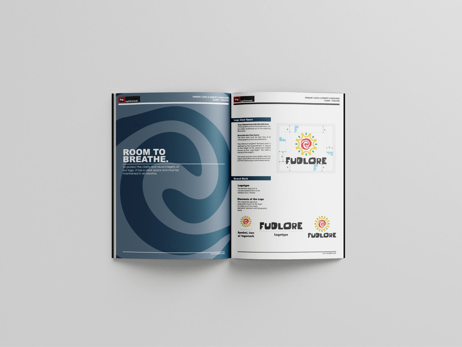
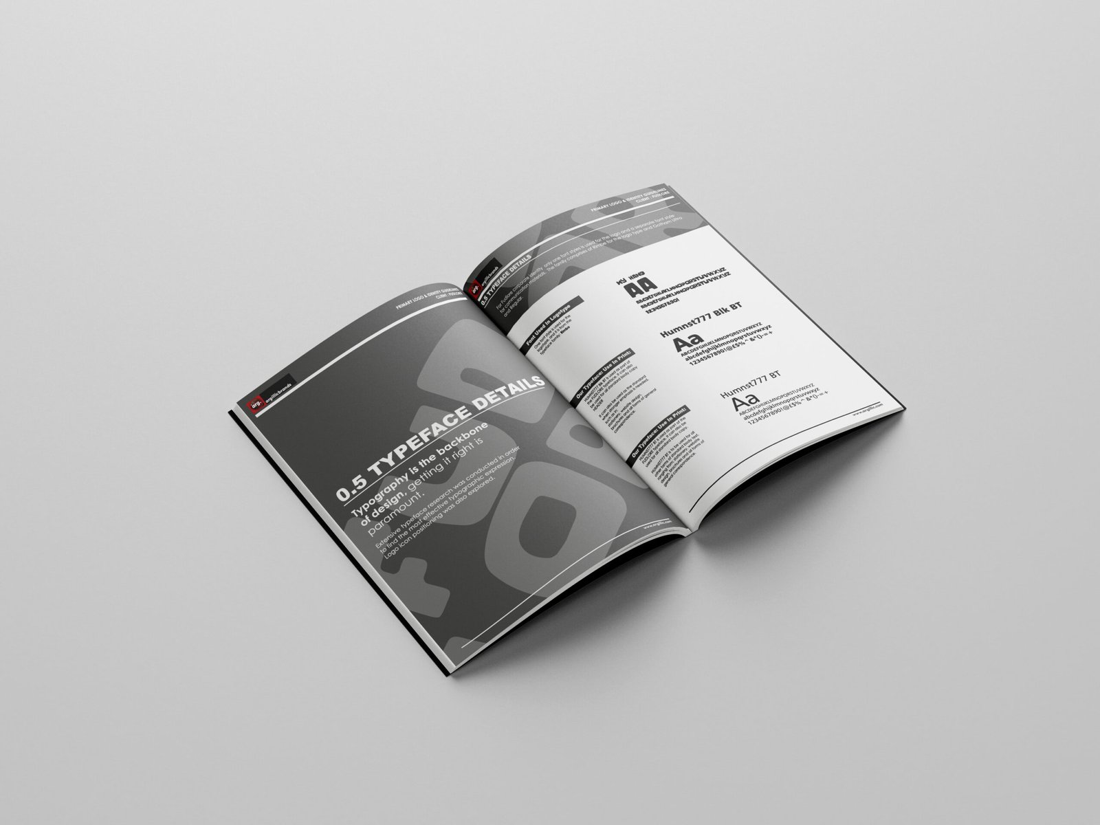
Selected brand guidelines
The foundation of a recognisable system.
The selected pages show how the identity was defined and applied. Select a page to read it in the image viewer.







04 / Packaging
Different products. One family.
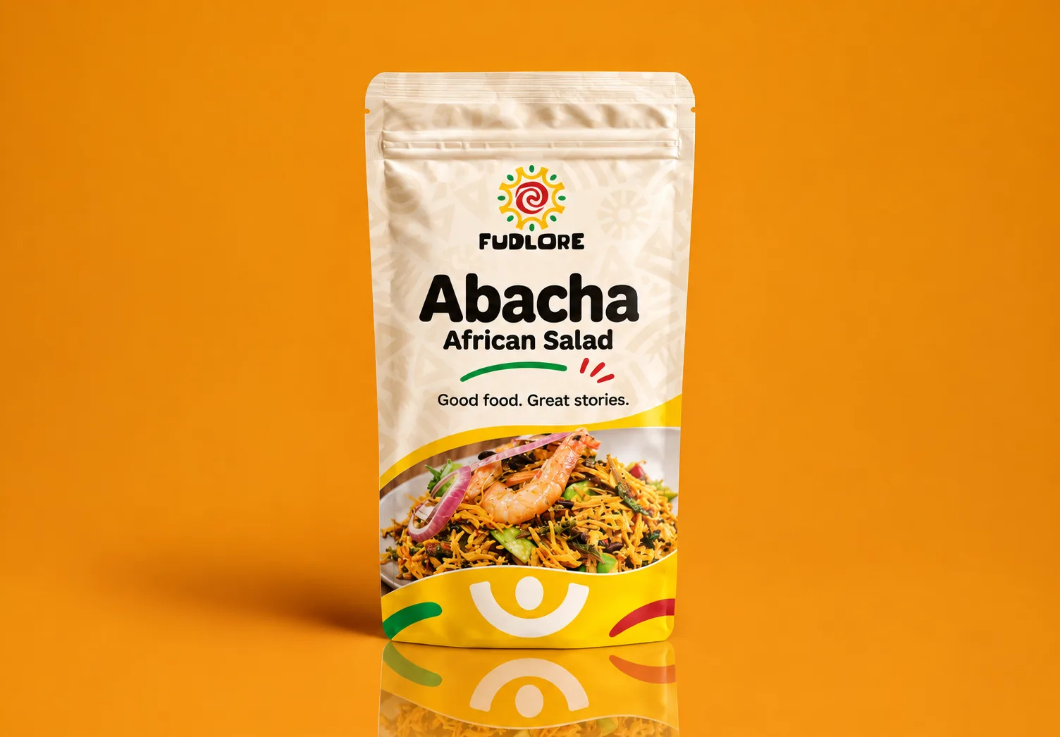
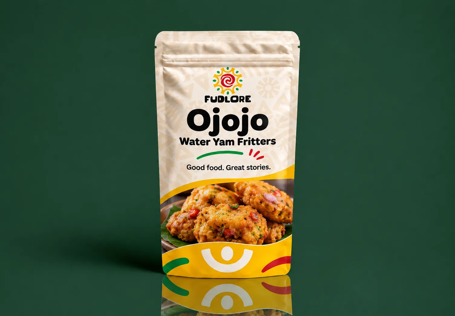
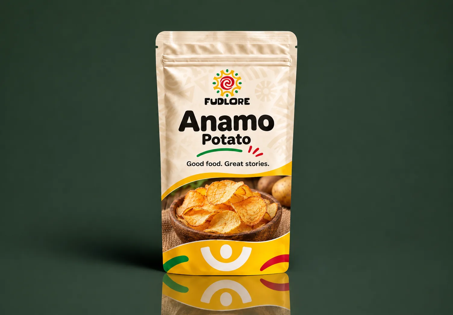
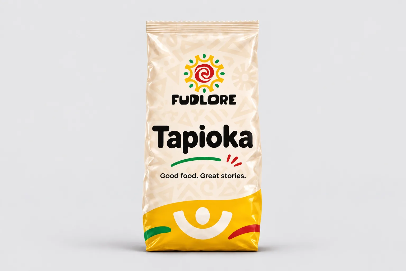
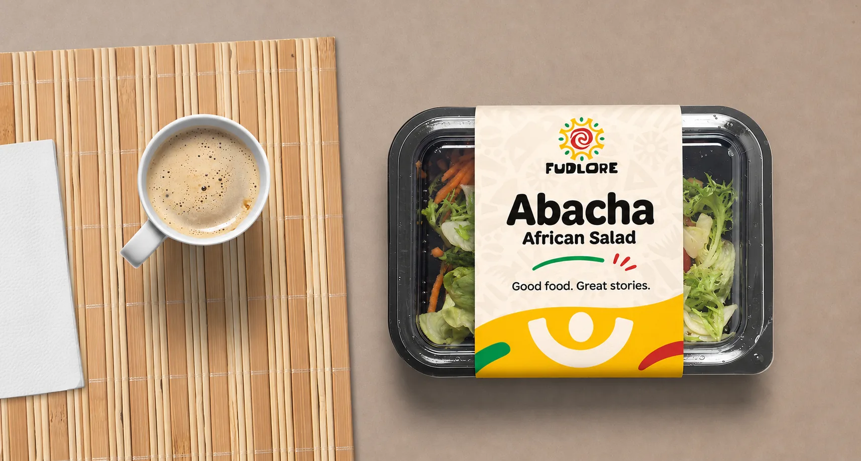
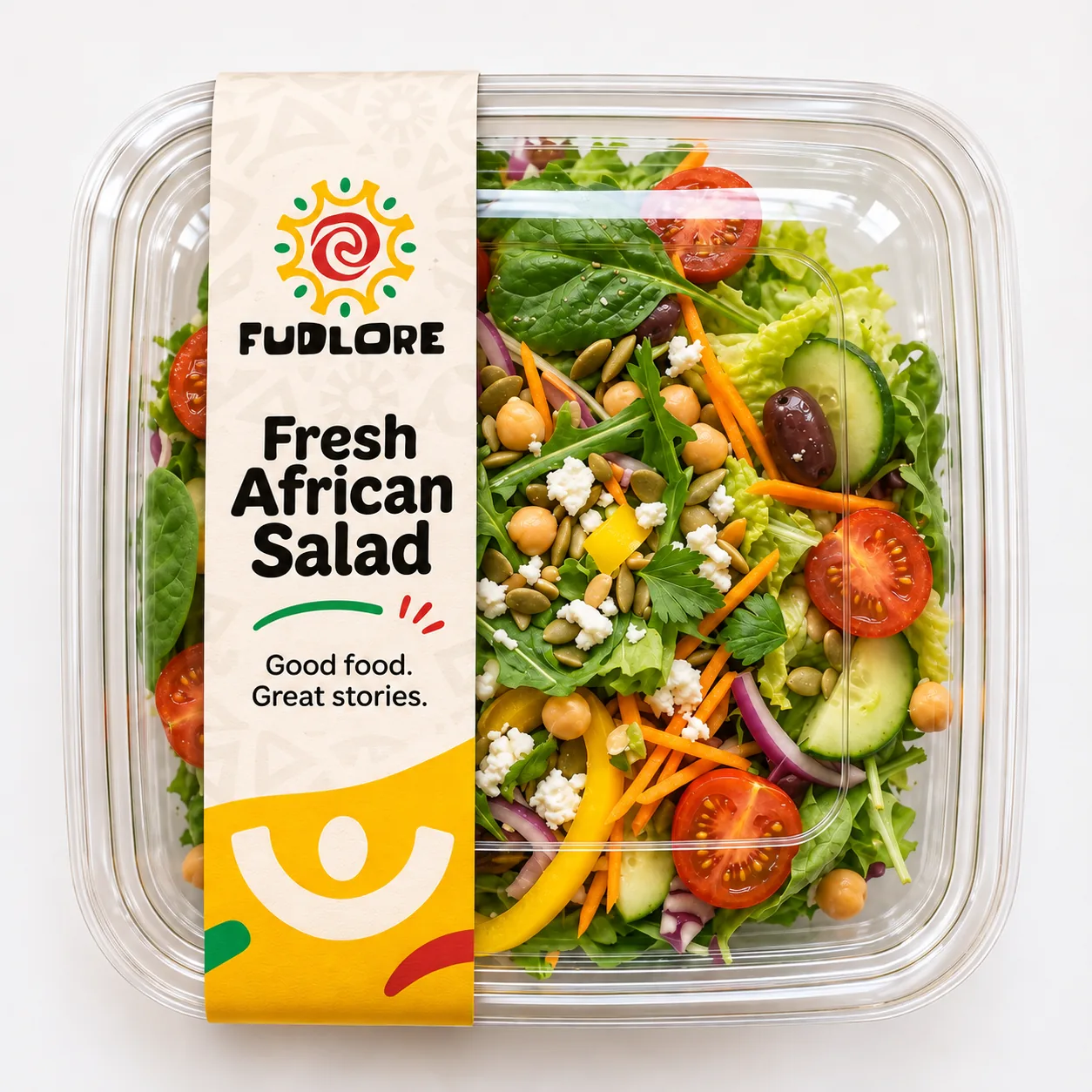
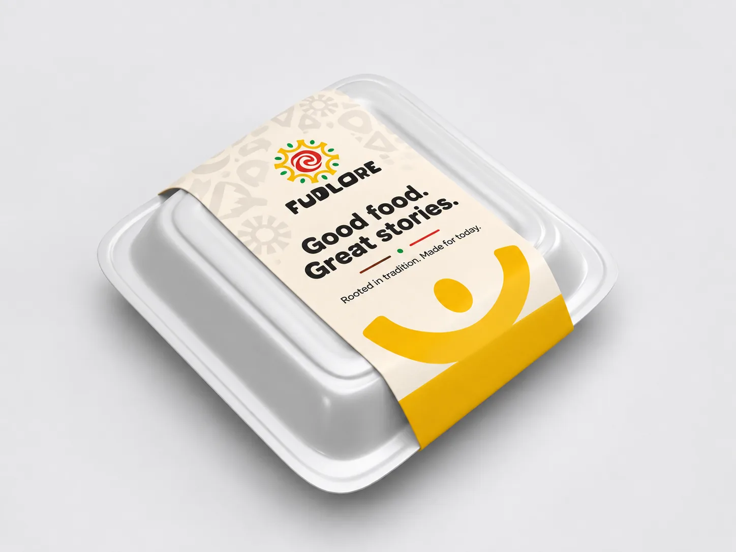
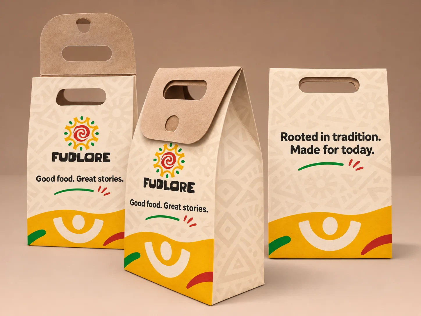
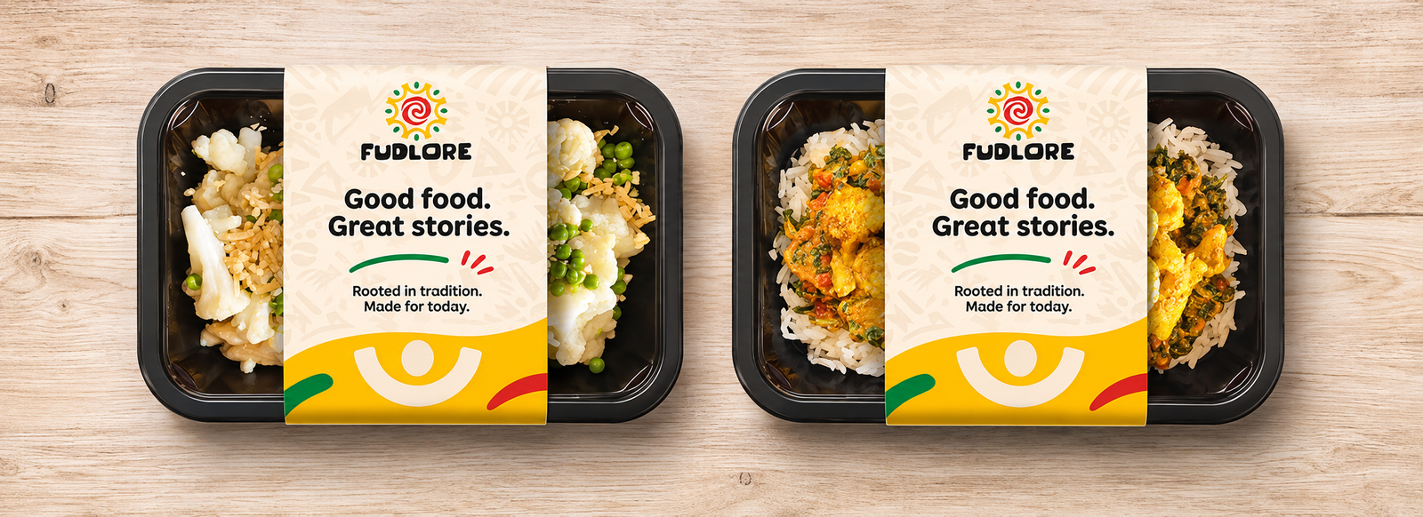
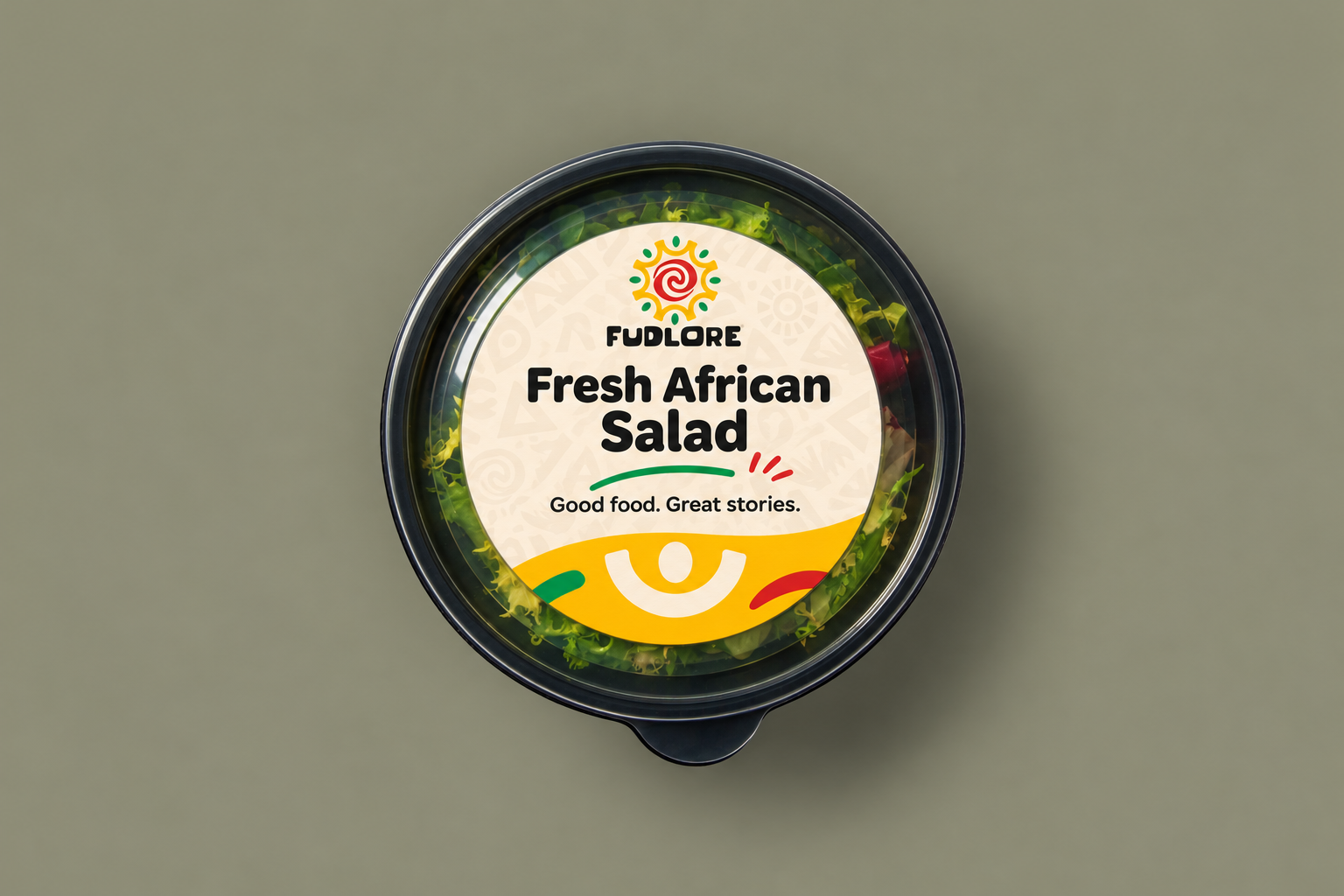
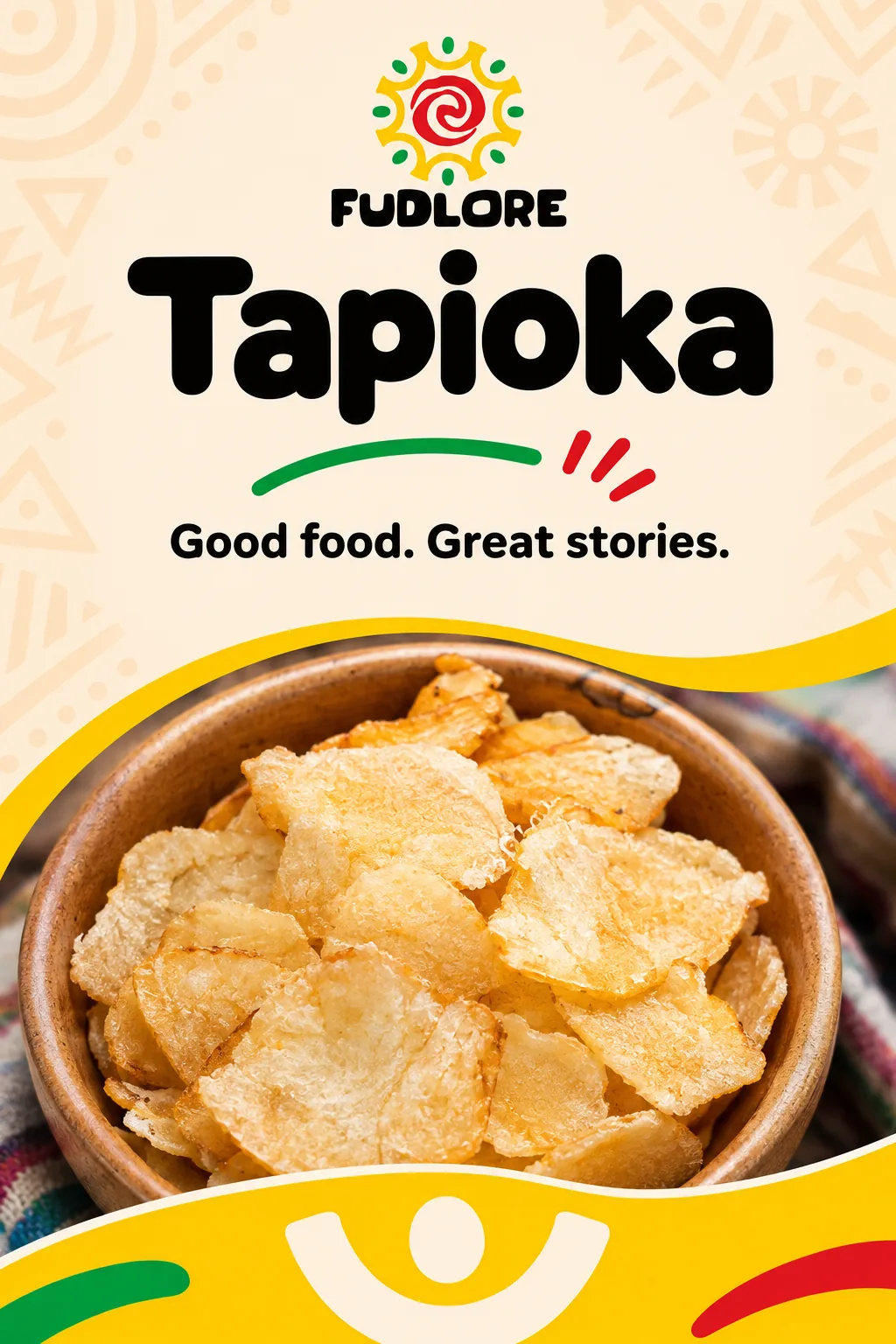
A consistent hierarchy brings the range together: the Fudlore identity, a clear product name, an inviting food image and a recognisable cream-and-yellow graphic language.
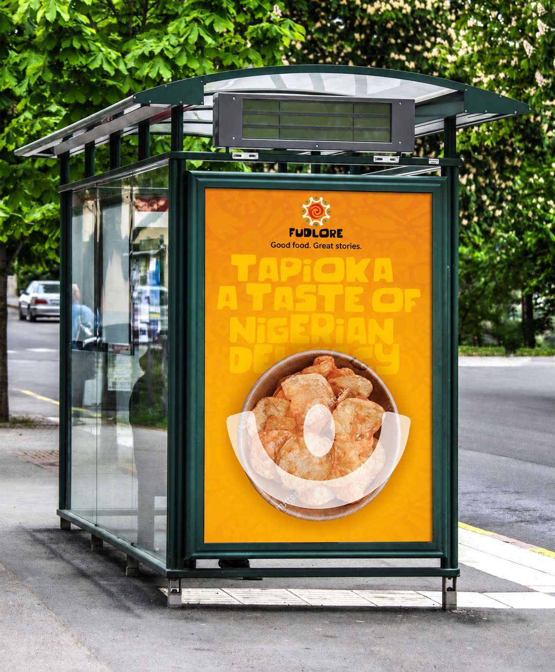
The direction extends across Abacha, Ojojo, Anamo and Tapioka packs, fresh-food containers and takeaway sleeves. These refreshed visualisations show design concepts, rather than manufactured packaging or verified retail listings.


05 / Campaign
Good food opens the conversation.
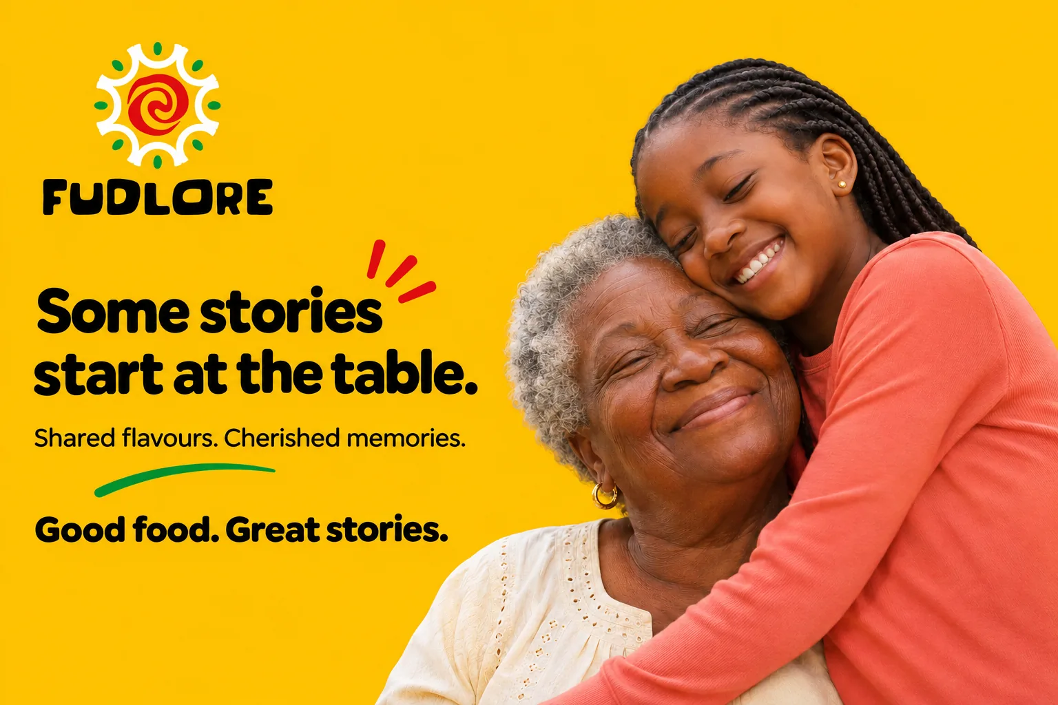
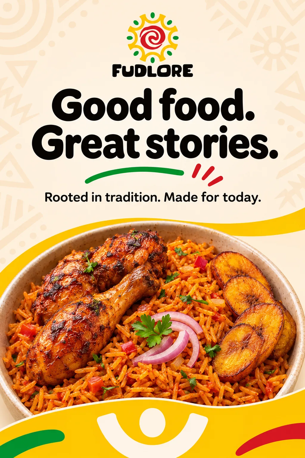
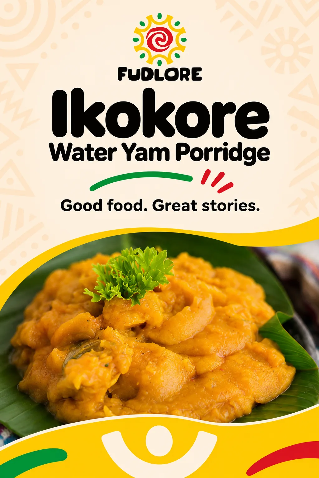
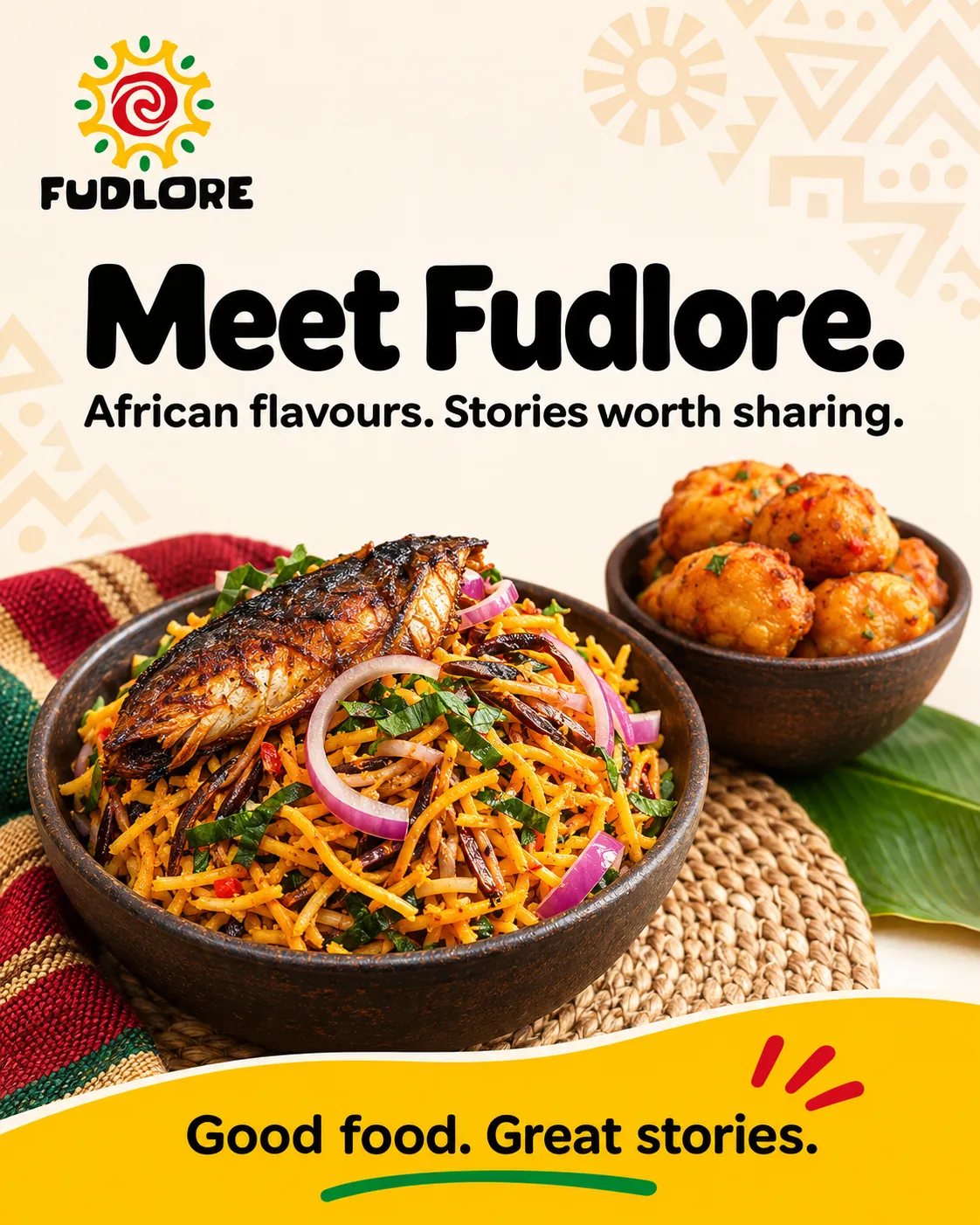
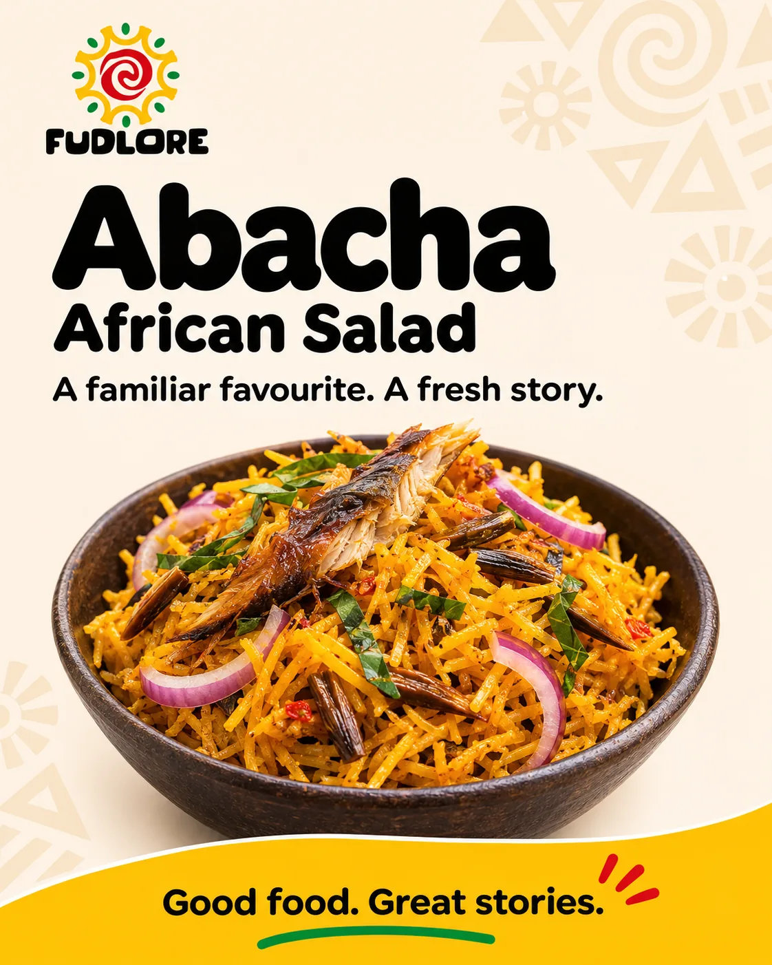
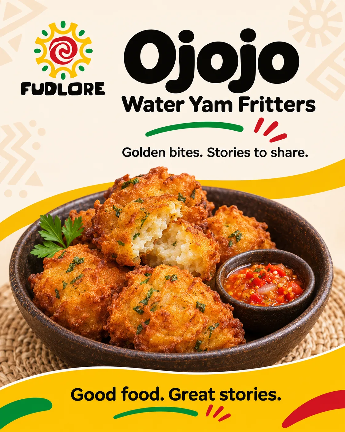
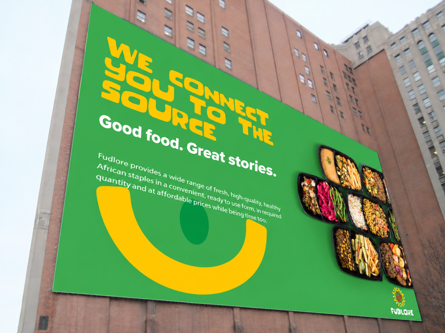
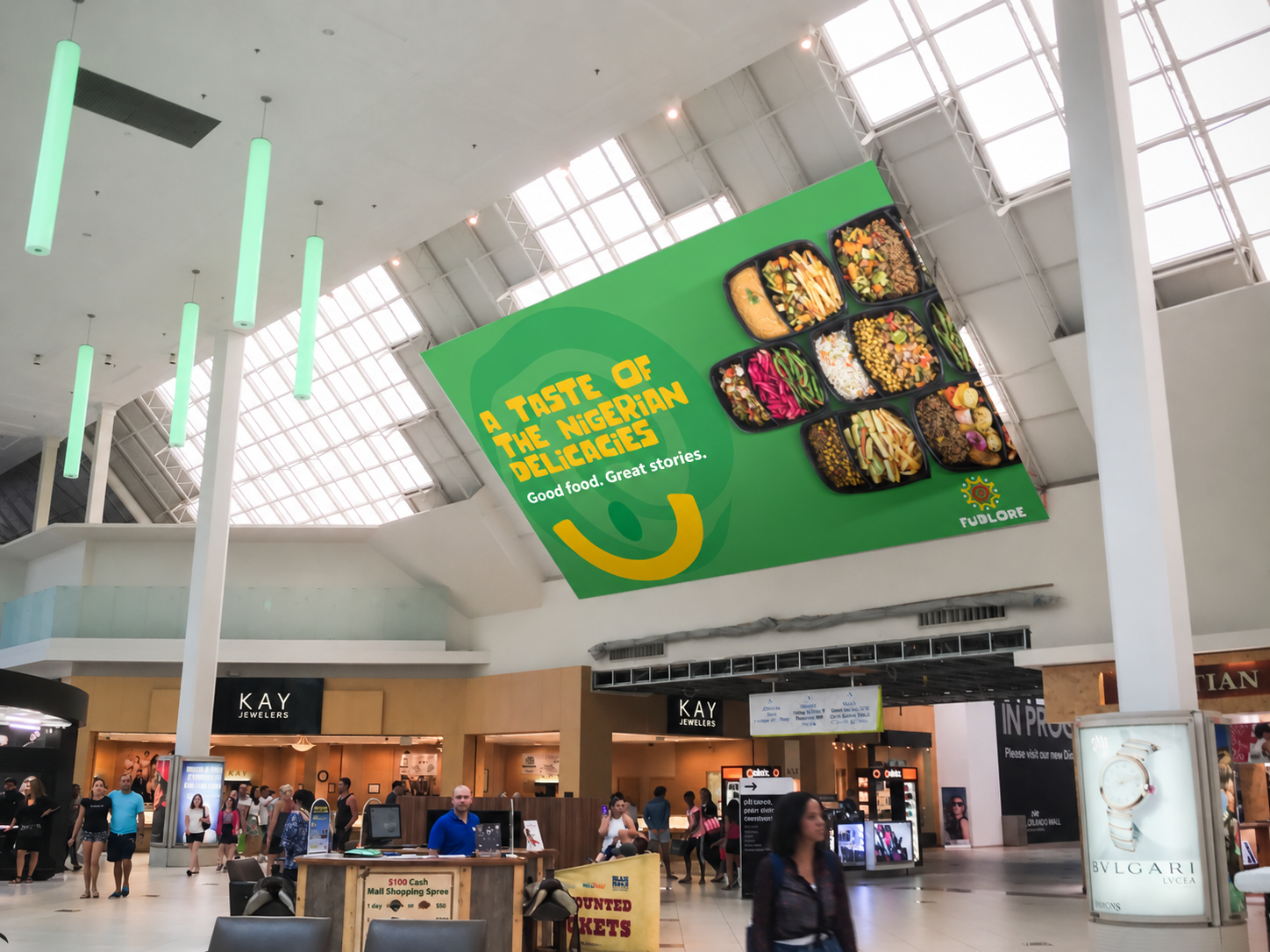
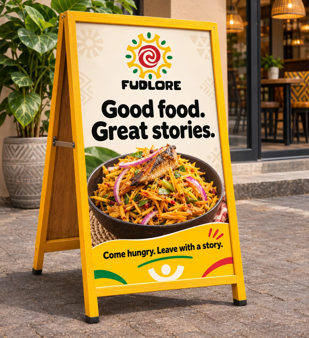
The campaign connects appetising food with the people and memories around it. “Some stories start at the table” gives the brand a human expression, while dish-led posters and social cards make the range easy to recognise.
A short Abacha motion pilot explores a floating-pack presentation with moving ingredients. The pilot is a four-second silent concept in 16:9. Campaign images and mockups are creative presentations, not evidence of placed advertising.






06 / Touchpoints
The story continues beyond the pack.
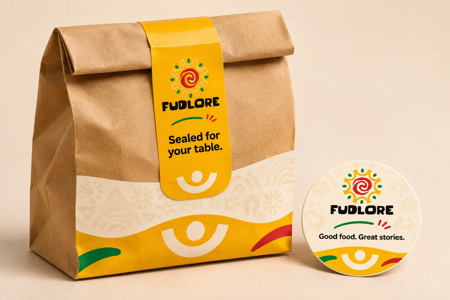
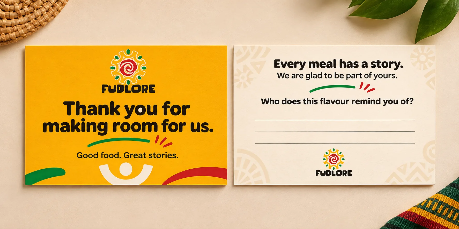
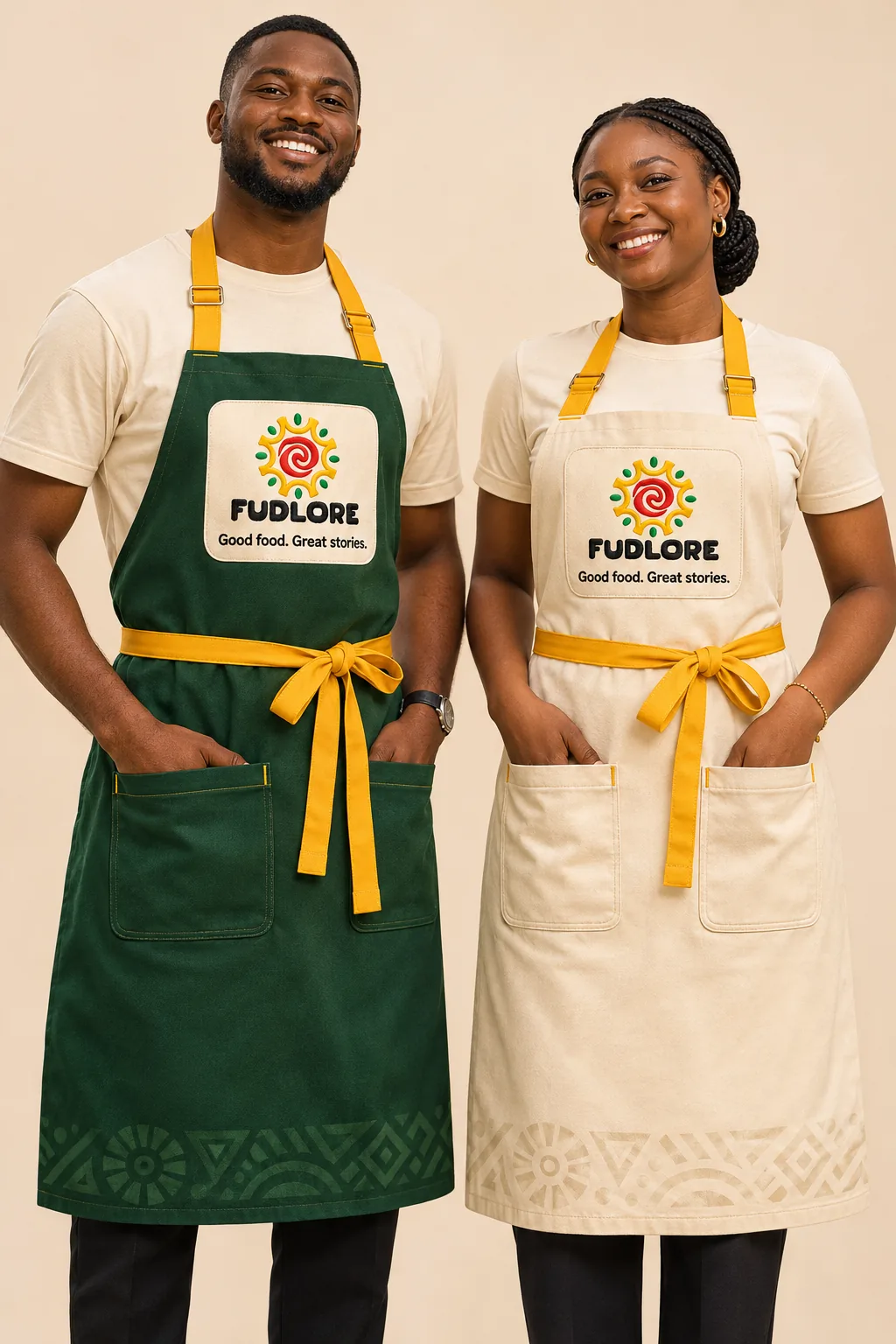
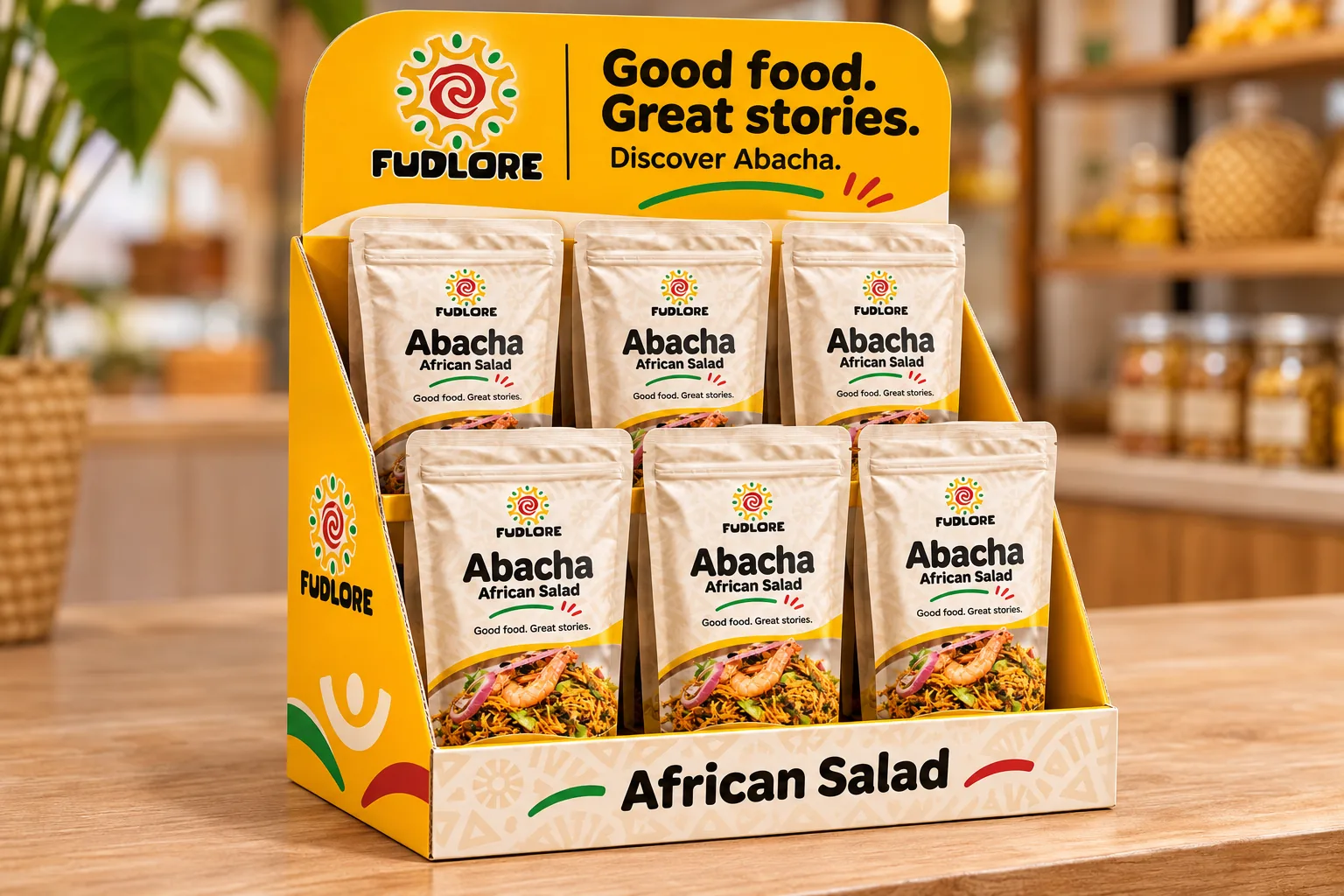
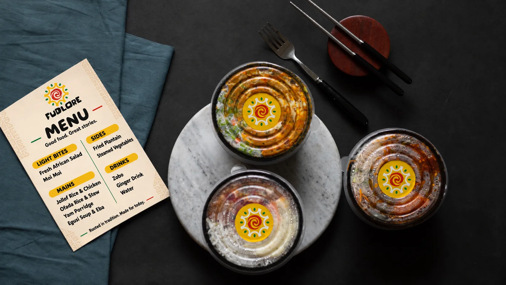
Delivery seals, thank-you cards, apparel and simple retail displays carry the same character into customer interactions. The thank-you card invites people to connect a flavour with someone they remember.
Together, the original naming and identity work and these refreshed concept applications show how one brand idea can guide many formats. This is a design-system presentation; sales performance and production rollout are not claimed.

The connected scope
From direction
to application.
- Brand naming
- Brand positioning
- Messaging & tone of voice
- Logo & identity system
- Brand guidelines
- Packaging design
- Campaign concepts
- Social launch materials
- Retail & delivery applications
- Product motion concept
Client perspective
“These guys have soul rather than just being creative and trendy.”
Your next project
Build a brand
with a story to tell.
Talk to Argillic about naming, positioning and a consistent expression across your brand’s touchpoints.
Discuss a project