Selected work Strategic Architecture
GlowHaus Body sculpting.
Distinct character.
Luxury with a playful streak.
A complete visual identity for a body sculpting startup in California’s Bay Area, built around a bold, fun, modern and eclectic direction.
Explore the project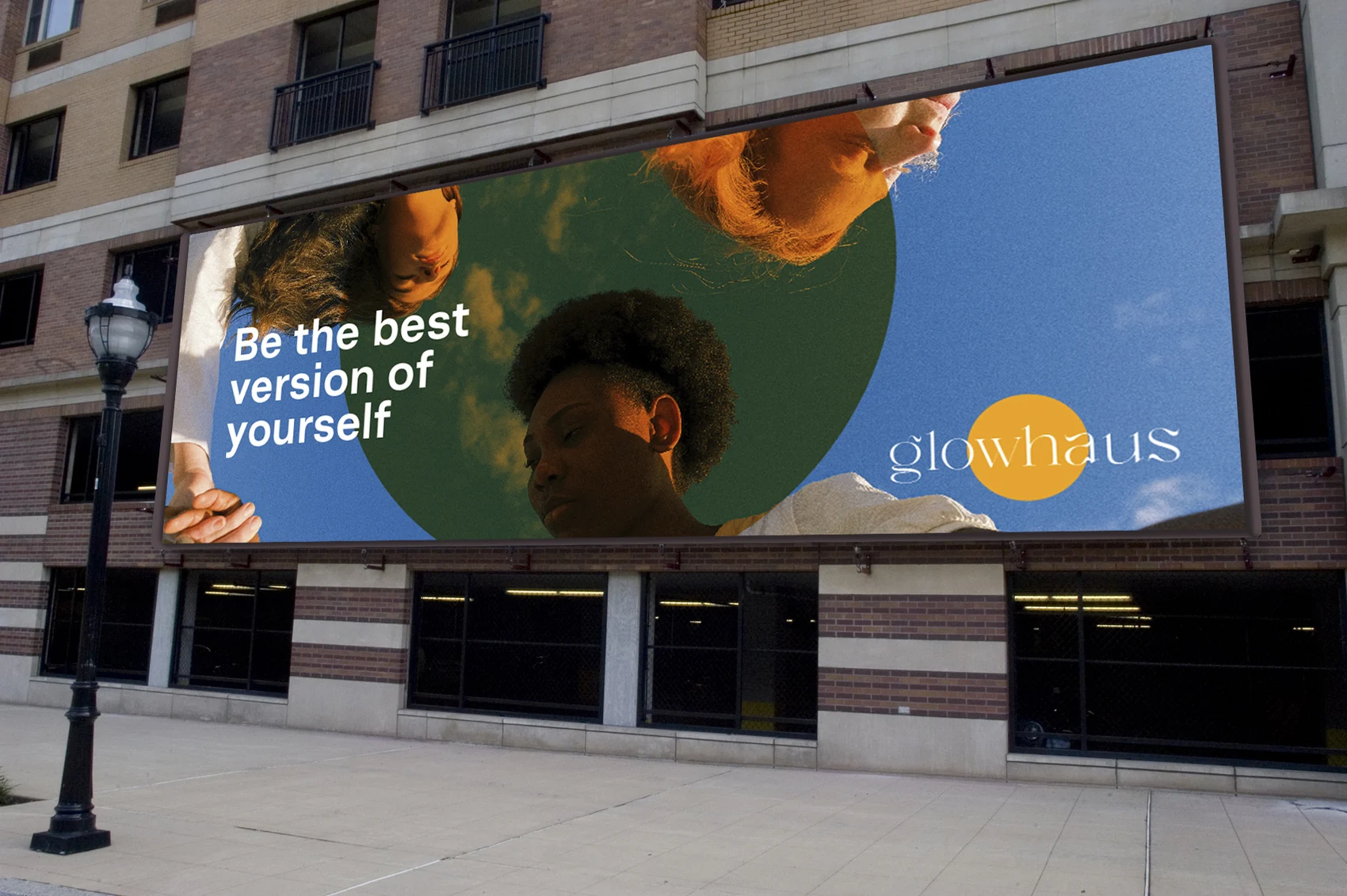
- Client
- GlowHaus
- Project context
- Body sculpting startup
Bay Area, California, USA - Capability
- Strategic Architecture
- Argillic’s role
- New brand identity
& visual guidelines
The creative decision
Three directions.
One clear choice.
Following the brand identity questionnaire, Argillic developed three moodboards. GlowHaus selected Direction 01.
- Direction 01Selected
Bold. Fun. Luxury.
Modern and eclectic.
- Direction 02
Luxury. Curated. Clean.
Earthy and quirky.
- Direction 03
Bold. Fun. Luxury.
Eclectic.
Creative direction summaries.
01 / Context
A new brand with a distinct personality.
GlowHaus is a body sculpting startup based in the Bay Area, California, USA. GlowHaus approached Argillic to develop its full brand identity system.
The brief called for an identity that could combine a luxury character with colour and playfulness, giving the new brand a consistent way to introduce itself.
02 / Approach
Turn a chosen mood into a visual language.
The process began with a brand identity questionnaire. Argillic translated the responses into three moodboard directions, allowing the client to compare distinct expressions before the identity was developed.
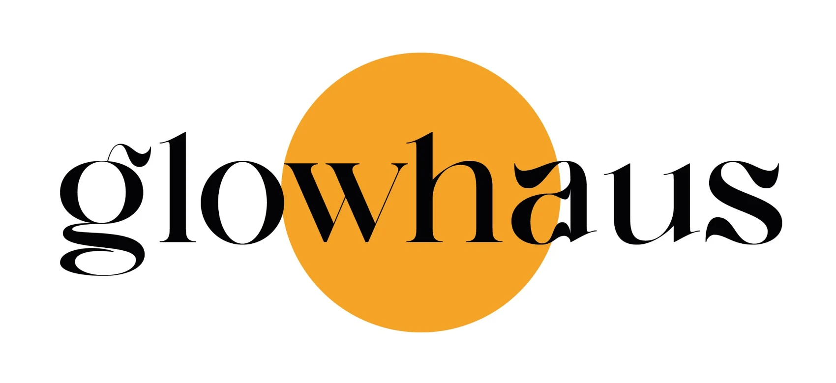
GlowHaus chose Direction 01: bold, fun, luxury, modern and eclectic. The resulting identity pairs an expressive wordmark with a sun-like circular device, warm colour and contrasting supporting tones.
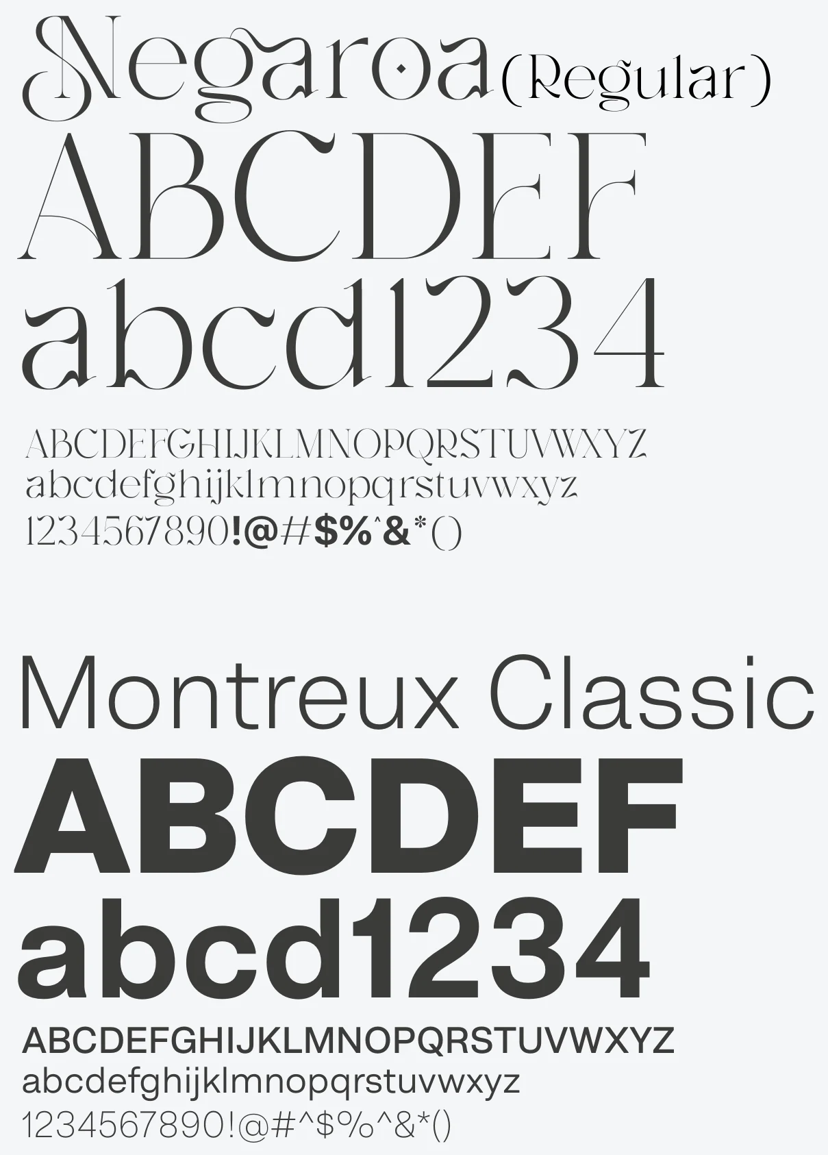
The typography, graphic style and application rules extend that chosen character beyond the logo.

03 / Implementation
Give the identity a practical framework.
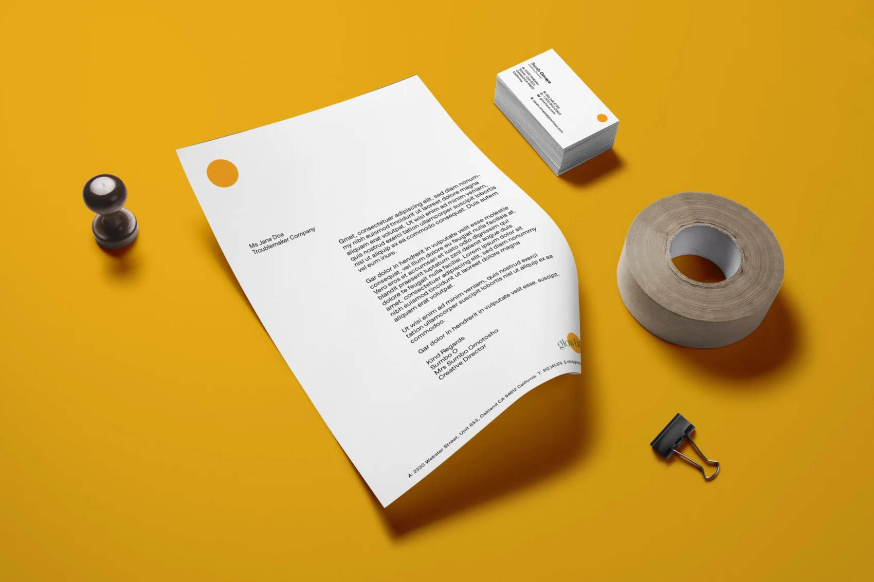
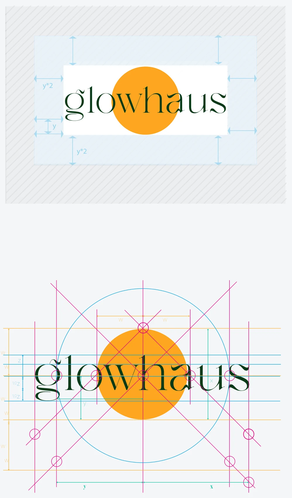
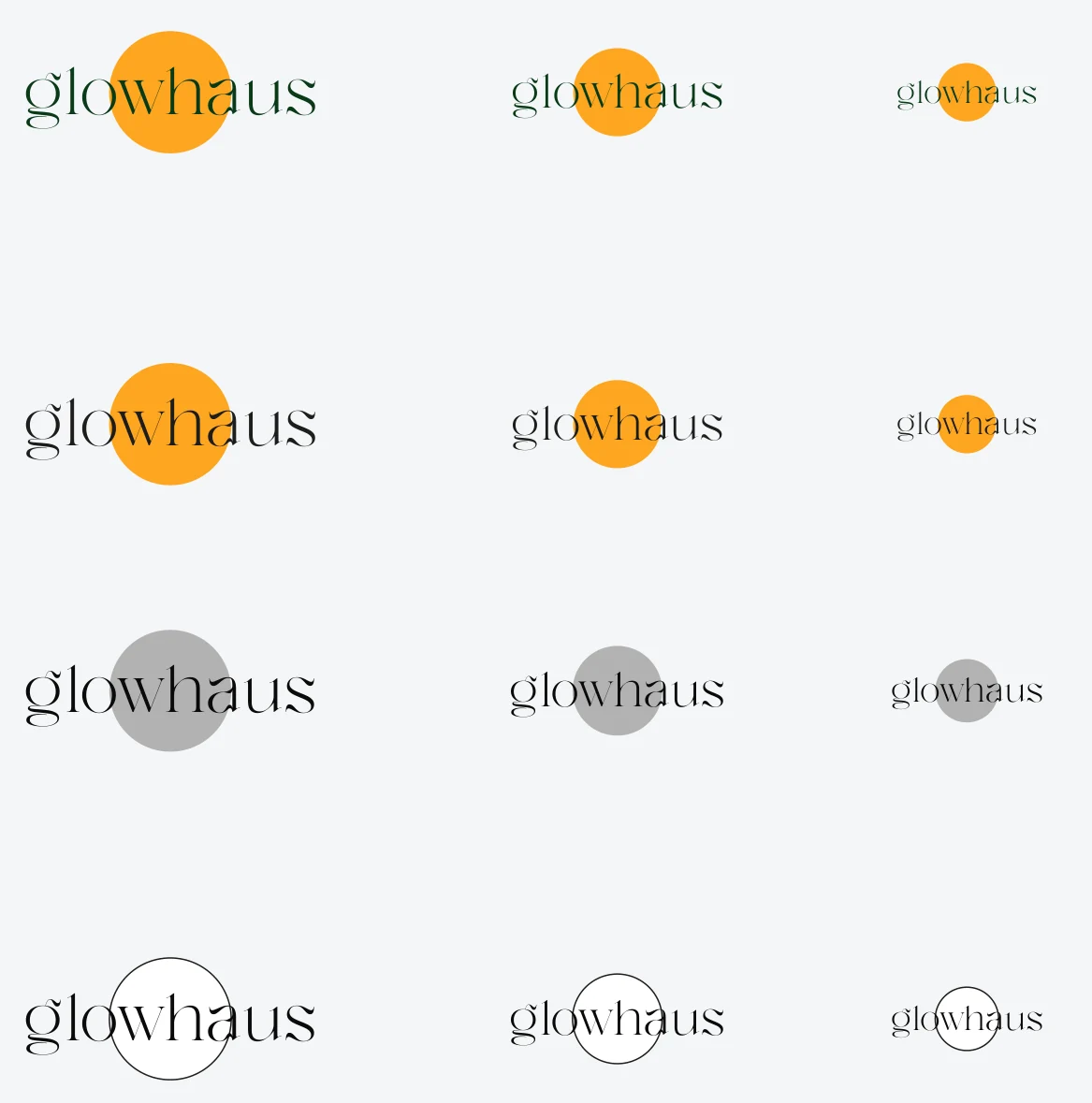
Argillic developed the logo, colour palette, typography, graphic style and brand identity guidelines as one coordinated system.
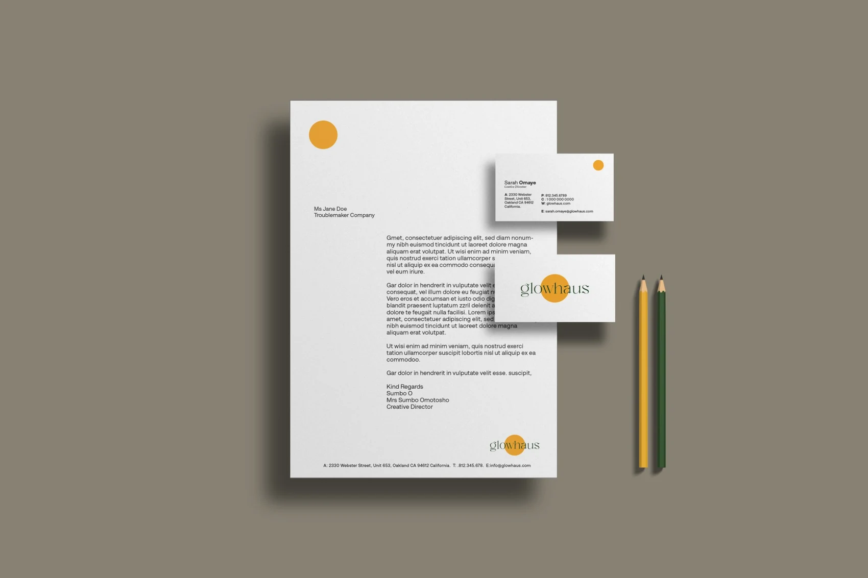
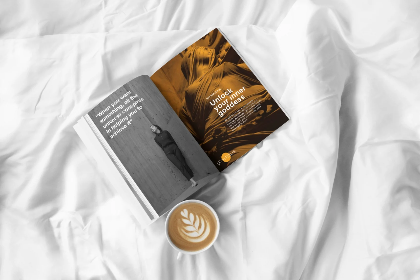
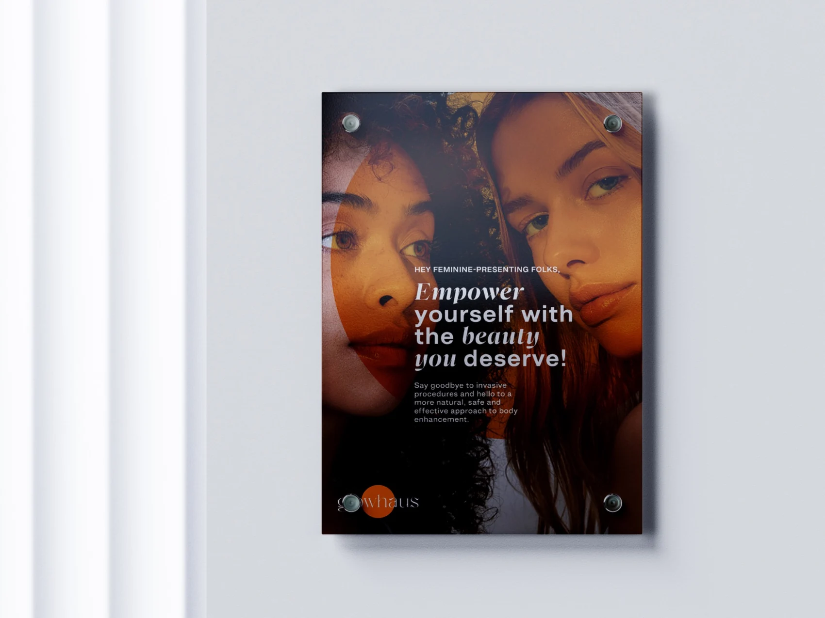
The guidelines document how the visual elements work together, with examples spanning stationery, editorial layouts, communication and branded applications. These examples give future materials a common visual reference.
The selected presentations show design applications rather than photographs of confirmed production or installation.
04 / Outcome
A coherent identity, with room to express itself.
GlowHaus received a complete identity system and guidelines translating its selected creative direction into a consistent visual framework.
The work gives the startup a foundation for presenting itself across communication and branded materials while retaining the playful, expressive character chosen at the outset.


The connected scope
From identity
to everyday use.
- Brand identity questionnaire
- Three moodboard directions
- Logo design
- Colour palette
- Typography & graphic style
- Brand identity guidelines
Application mockups illustrate the GlowHaus identity system. They do not document physical production, installation or paid media placements.
Your brand’s next chapter
Build an identity
with a clear direction.
Talk to Argillic about an identity system that connects your organisation’s purpose with the way it presents itself.
Discuss your projectExplore our capabilities

