
The Voice of Yellow : 7 Most Commonly Used Colours in Environmental Branding
It’s the beginning of the week. You are probably feeling reluctant about getting up from your comfortable bed, getting on the road since your body has already acclimatised to working from home: all probable “social distancing welcome backs” after 3 to 4 months of lockdown due to the COVID-19 virus.
Imagine making this return to a dull, grey office with your dull-coloured cubicle and bland-accented everything else. It’s not very cohesive to permit productivity the moment you make it into your workplace.
Now, visualise walking through the doors and entering a modern, open office with vibrant blue walls, sleek furniture, lower-to-the ground desk walls, and a pool table surrounded by engaged and cheerful coworkers.
If the second narrative sounds like a better deal, it’s because surrounding yourself with shades of blue can help reduce anxiety and lower-to-the ground cubicles help alleviate feelings of being “trapped” at work.
These simple changes seem to be a no-brainer. Yet, you’d be surprised how many employers don’t take advantage of the effects that environmental branding and simple interior design details can have on productivity and overall morale of their workers as well as the comfort of clients.
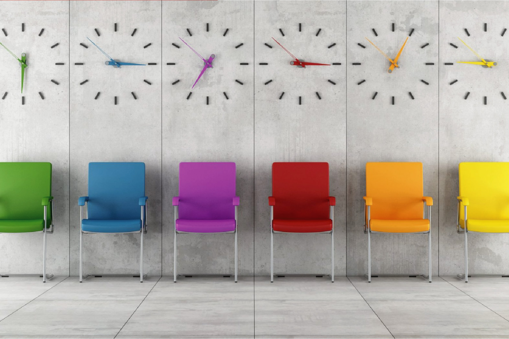
Colour enriches our lives in both subtle and powerful ways. We get an instant feel of a room as soon as we enter it, and that feeling can be anything from cosy to clinical, or from peppy to calm. The office is no different.
Colour triggers certain moods in people. However, what moods are triggered varies from person to person and can be influenced by a person’s native habitat and cultural background. Nevertheless, certain moods are generally associated with colours.
For instance, warm colours – yellow, red, and orange are said to cause feelings of warmth and comfort or anger and hostility while cool colours – On the other hand, colours like blue, purple, and green induce feelings of calm and serenity or sadness.
Every colour has a voice, and that voice speaks to our perception in different ways. For instance, according to holistic colour consultants; did you know that a spoonful of your favourite dessert could taste better (or worse) depending on the colour of the dish it’s served inside? Astonishing, right?
Colours within the workplace encourage productivity, affects moods, attitudes, and emotions.
If there’s scientific evidence showing this is true (and there is), then inevitably, colour can impact other areas of our life, for example, mood and workplace productivity. It isn’t hard to imagine that these, too, could benefit from exposure to the right colour. So, what then is the right colour?
As with anything in life, what’s ideal in one situation may be counterproductive in another. And the colour is no exception.
Our colour choices in the built environment are made not only through personal preference but also through the knowledge of the benefits that specific colours can bring. We know that certain colours can positively contribute to happiness, productivity, and even physical health in the workplace.
However, we cannot rely solely on a coat of paint or wall morals to reach these objectives alone — it is the combination of colour, lighting, and other environmental branding features that can make a space the most supportive for employees. Our work involves finding the right balance between customising the space with unique company attributes and ensuring it is a comfortable and enjoyable place for people to work effectively.
Colour Influences Productivity, Creativity, and Mood at Work
Colour itself is a visual experience that subconsciously affects the brain and, therefore, how we work. Deciding what colour scheme to incorporate into your environmental design needs careful planning in order to stimulate the right kind of productivity from your employees.
Colour is a crucial component in many aspects of modern life, and not just in the workplace. As environmental branding experts, we know that office colour psychology not only affects the way your staff works and how productive they can be, but it also affects how visitors perceive and evaluate your brand. Hence, it is essential to choose the appropriate colour and design to present yourself to both internal and external audiences alike adequately.
Not only do colours within the workplace encourage productivity, but they also affect moods, attitudes, and emotions. In this space, we will take a look at the effects that different colour has on the working environment, as well as give recommendations on how to use specific colours appropriately.
Argillic Brands have long espoused the positive psychological effects that colour can have on employees in the workplace, ranging from calm, creativity, or enthusiasm. Here, we look at how a variety of colours and hues can help transform your office.
The Power of RED
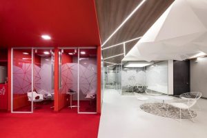
Project Title: Red Hat by AEI Arquitectura e Interiores, Bogotà, Colombia
Because red is a colour that stands out and draws attention, you need to make sure to use red for anything that you want your employees to remember. Also, if employee tasks involve any physical activity, consider painting the surroundings in red. This will give your employees a mental productivity boost.
Otherwise, be careful about using the colour red! It can make your employees feel anxious. Hence, the best strategy would be not to use red as the main colour, but as an accent in your environmental branding design.
The Power of BLUE

CMC_office
When used in the workplace, blue has a calming effect on employees and so reduces stress. It also helps to better concentrate on a given task and, thus, increases productivity.
Though, be cautious when using blue if you run a business that promotes food, cooking, or baking. Blue is unappetizing! It slows down the human metabolism and suppresses appetite.
Also, pay attention to the tone of blue colour – darker shades evoke sadness.
The Power of YELLOW

Getty Image Office
It produces a warming effect and stimulates mental activity. Since yellow is a warm color that stands for imagination, you can use it if you want your employees to be more creative.
Be careful, though, if you want to evoke feelings of stability and safety!
Yellow is a colour of cheerfulness and spontaneity. It doesn’t stand for protection or security.
Also, be mindful of the shade of yellow you use. Light yellow walls will bring warmth, freshness, and joy into the workplace. On the other hand, dark yellow walls might send a message of illness or decay.
The Power of ORANGE

Orange is hot, but not aggressive, and young people accept it. It also has several effects on our physical health: it increases oxygen supply to the brain, stimulates brain activity, and energizes.
Orange stands for change. Use orange wall decals or paint your wall orange if you want to help your employees make decisions, boost their self-confidence, and enhance understanding. If your employees have to communicate a lot, make sure their surroundings are orange as well! The colour will help them socialize, increase their inspiration, and make them love their workspace even more!
Also, check the different message shades of orange send to people:
Dark orange – deceit and distrust.
Red-orange – passion, action, and domination.
Golden-orange – prestige, wisdom, and wealth.
Peach-orange – friendliness, and delicacy.
The Power of GREEN

Biophilic Office Design
Since green is known to symbolize free passage, it’s a colour of safety. Green is also known to slow human metabolism. And just as blue, green produce a calming effect. You might introduce green into your workplace if your employees have stressful jobs or suffer from work depression. Green is alleviating, so it’ll make them feel more comfortable while working.
Also, green is the best colour for those who work long hours. It’s restful and improves vision. So, if your employees have long shifts, help them go through them by adding more green to their surroundings. You can also consider “biophilic design” in your environmental branding.
The Power of WHITE

White is used within the workplace to complement other colours. Whilst they create a sense of comfort to the workspace, alone they are not particularly stimulating.
If you paint your walls white, you suggest simplicity and an auspicious beginning. Be cautious, though! Too bright a white can cause headaches!
White is also known to clear people’s minds, encourage pure thoughts, cleanse negative emotions, and promote renewal.
The Power of BLACK

Lechte Corporate Office Melbourne
Black is the colour of night and shadows. Black has also got a negative connotation (black humour or black death) and produces feelings of fear of the unknown (black holes).
You can use the colour black if you want to add a sense of formality to your office. Be careful, though, with using black as the background for text on walls – it can diminish readability.
Black can also evoke deep emotions, but too much of it is overwhelming. It makes people inconspicuous, increases their sense of possibility, produces feelings of emptiness as well as gloom and sadness. So, don’t overuse it!
Are there colours you should avoid?
While designing an office for your employees, try not to paint walls in:
Brown – it makes rooms seem dark and gloomy.
All White – although it’s associated with cleanliness and purity, it’s the colour of hospitals.
Pink – it’s distracting, so your employees will find it hard to concentrate.
Now you know the hidden meanings behind 7 of the most common colours in the workplace.
When professionally done, a branded workplace sets the tone and culture of your company, grounding employees in the mission and values that your brand communicates. It requires enhancing the workspaces with environmental graphics and architectural signage that make the corporate culture a seamless part of the room.
Do you want to start a project or build a sustainable brand? Get in touch.
